Day 11 – MusicBeats – No White Challenge
Day 11: Disruptive Thursdays
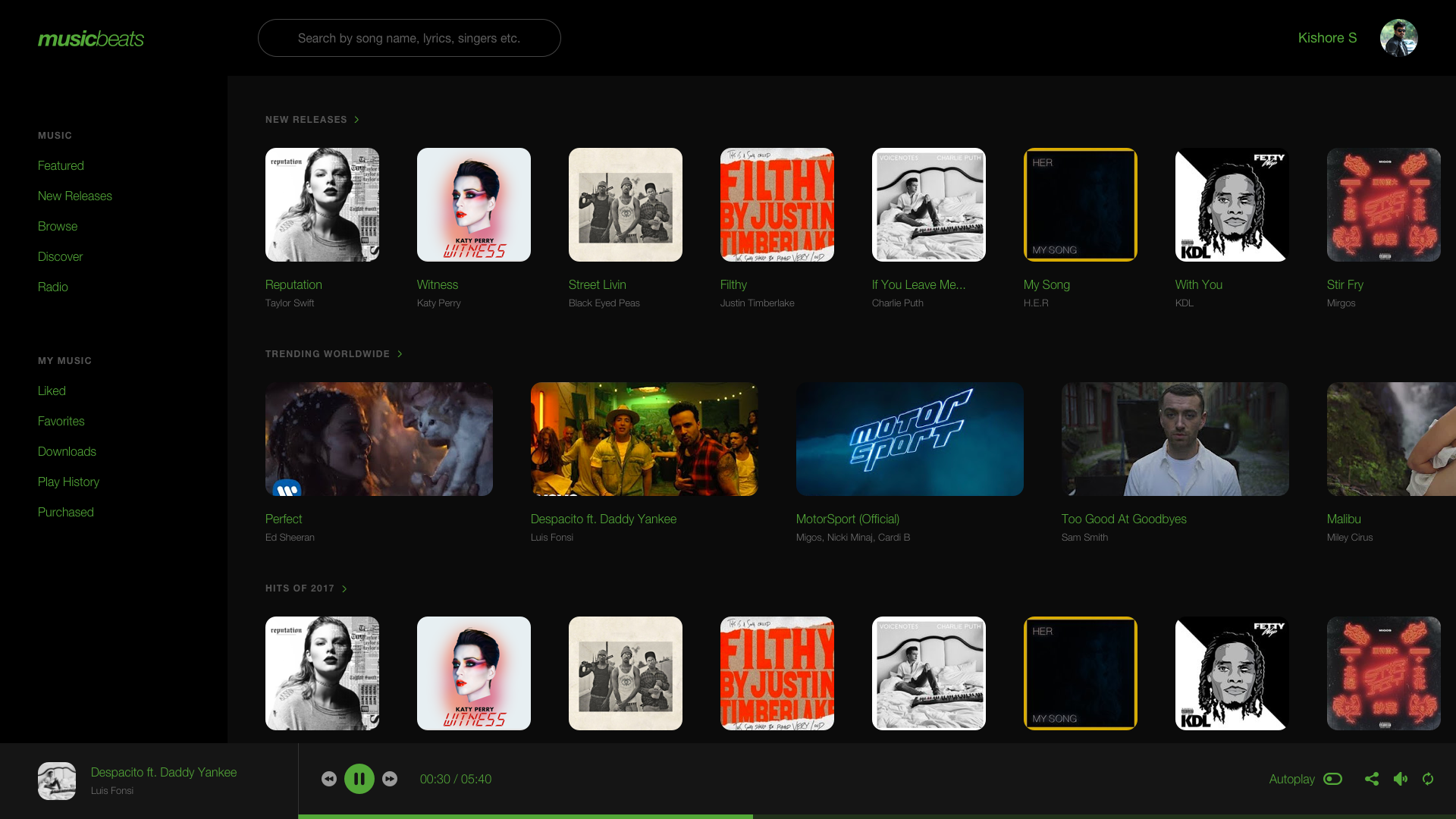
Brief: To design a music streaming platform without the color white, in UI.
For Day 11, the theme is Disruptive Thursdays, which essentially is designing an interface with strict guidelines or disruptive, usually avoided forms of design. Which includes the worst possible typefaces, images, colors that can be used for a user interface. This week, I chose to avoid using the color “White” to design a music streaming platform. Like Spotify.
Before going into this challenge, I knew it’d be impossible to do something great without White. It’s kind of a dealbreaker for a designer like me. But that is the point of Disruptive Thursdays.
The process was to avoid white, hence the dark theme and to substitute white with a lighter color like red or green. Green was looking a lot better, hence I went with it. The typeface of choice was Helvetica this time. Also, this being a music platform, one can argue that the album art could have the color white in it, which defeats the purpose of this challenge. But, it’s the UI that matters. Without white, It’s difficult to make something clear, functional and visually pleasing.
Design Duration: 2 Hours
Typefaces used: Helvetica
Images: Respective Album Copyright Owners
Dribbble: Link
No White Challenge – Music Beats: