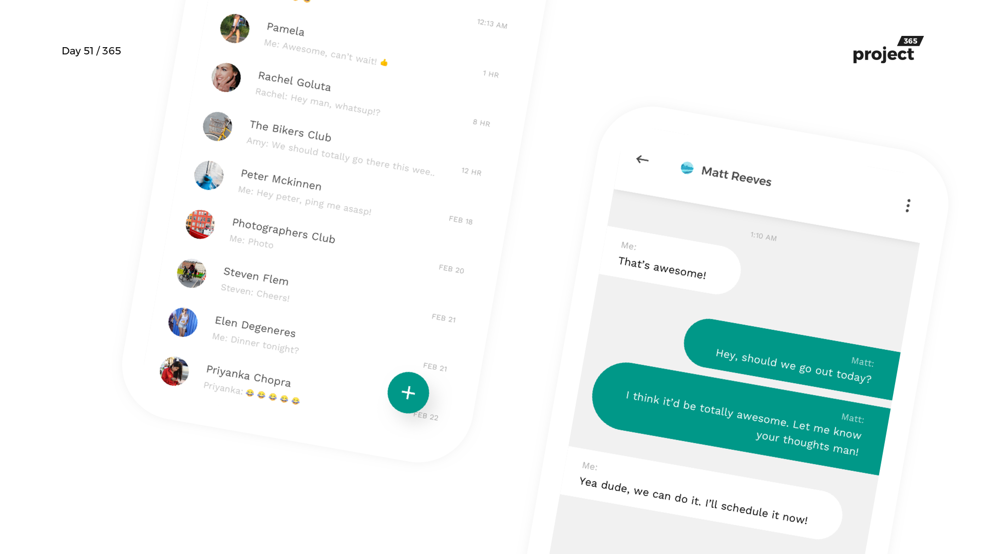
Day 51 – WhatsApp Redesign Concept
Day 51: Redesign Tuesday
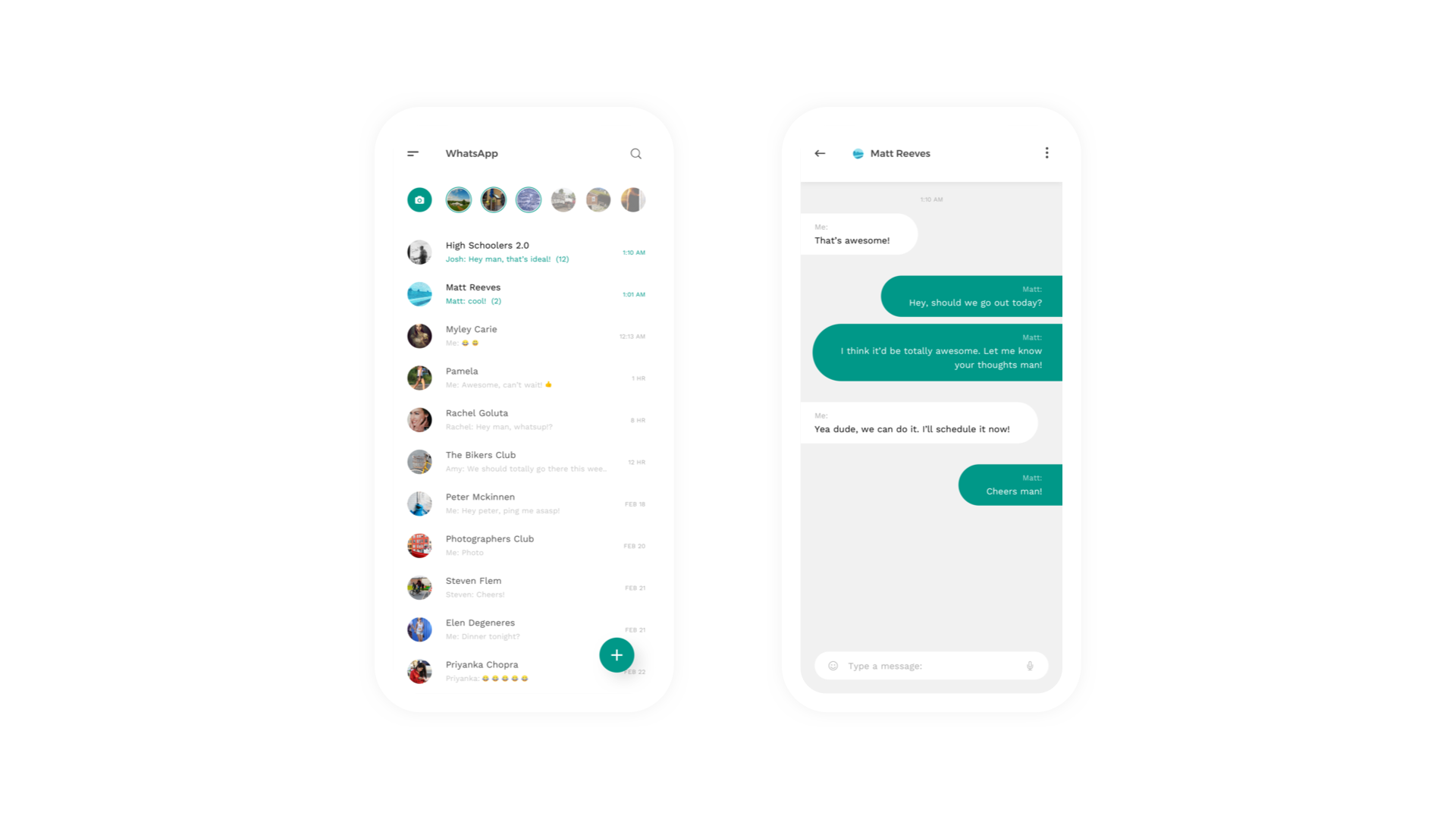
Brief: To redesign the WhatsApp iOS App Interface!
For Redesign Tuesdays, I usually would incline to redesign interfaces that I have been using regularly.
Here’s my take on WhatsApp!
This is not a radical redesign, where I bring in impossible UI interactions and transitions.
I’ve kept functionality and simplicity as primary factors and combined Instagram stories in WhatsApp.
Rest is pretty much inspired by Google’s Material Design. Nothing new or innovative just thought of bringing different visually beautiful things together on the WhatsApp app!
Let me know your take on this!
Design Duration: 2 Hours
Typefaces used: Work Sans
Images: None
Dribbble: Link
Design:


I would keep the TabBar instead of using the Side menu.
Although, the most used tab in the WhatsApp is the “Chats” tab, I feel like there is always something hiding if it is in the Side menu.
Great redesign, though! Thanks for sharing!
I agree that tabs are good, but I generally prefer not to use them as they serve as a distraction. often times I end up swiping right or left, triggering the story mode camera or stories by accident.
Probably having tabs without letting them swipe to the next tab or having an option to do so would help.
Thanks for your inputs again!
If I am Mark, I would have hired you for UI Designs. Came across your profile and designs. Nice Creativity, Keep it up and keep doing more. I see that you are mostly doing for mobiles, Why not web apps and dashboards ?
Hey Akhil, thanks a lot for your kind words. Coming to your question, I have designed quite a bit for the web aswell. Request you to check older designs 🙂
I wanted to learn and practice more on mobile as I was not experienced enough with it. It is actually one of the primary reasons I started this project365.
Hope that helped.
Cheers