Day 191 – Google Play Store Redesign – Material 2.0
Day 191: Redesign Tuesday
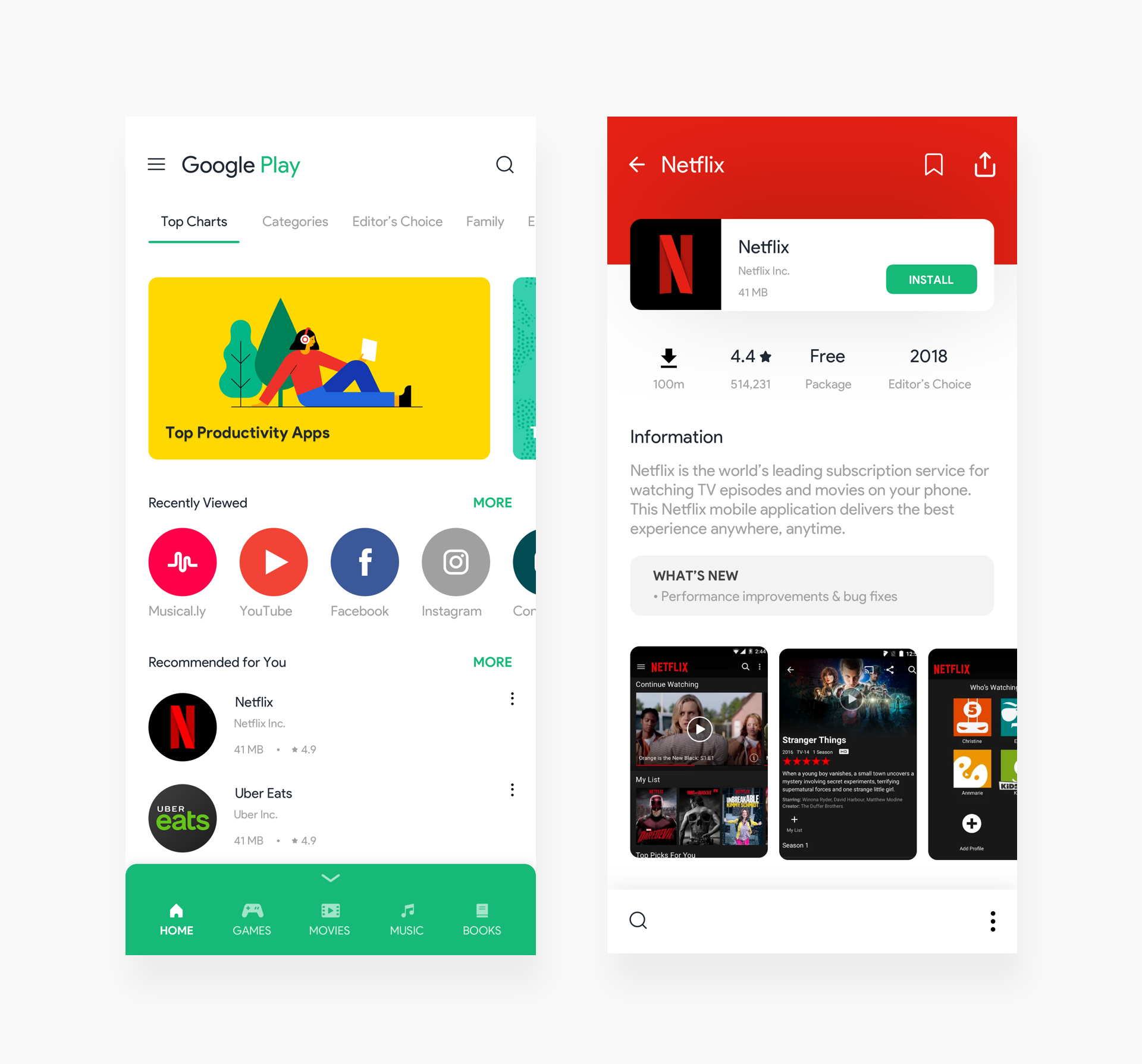
Brief: To redesign the mobile Google Play store with my vision of the Material Design 2018 guidelines.
For Redesign Tuesdays, I usually would incline to redesign interfaces that I have been using regularly.
Here’s my take on the Messy Google Play store.
My approach was to tidy up the complicated, multi-level navigation system. Make simpler sections on the bottom as a menu, customizable according to user needs.
All apps would have standard icon sizes, instead of anything.
Also, a lot of action does happen on the bottom, owing to the new Material Design language by Google 2018.
Let me know what you think of this one!
Design Duration: 4 Hours
Typefaces used: Product Sans
Images: Google Play
Dribbble: Link
Design: