Day 324 – UPS Mobile App Redesign Concept
Day 324: Redesign Tuesday
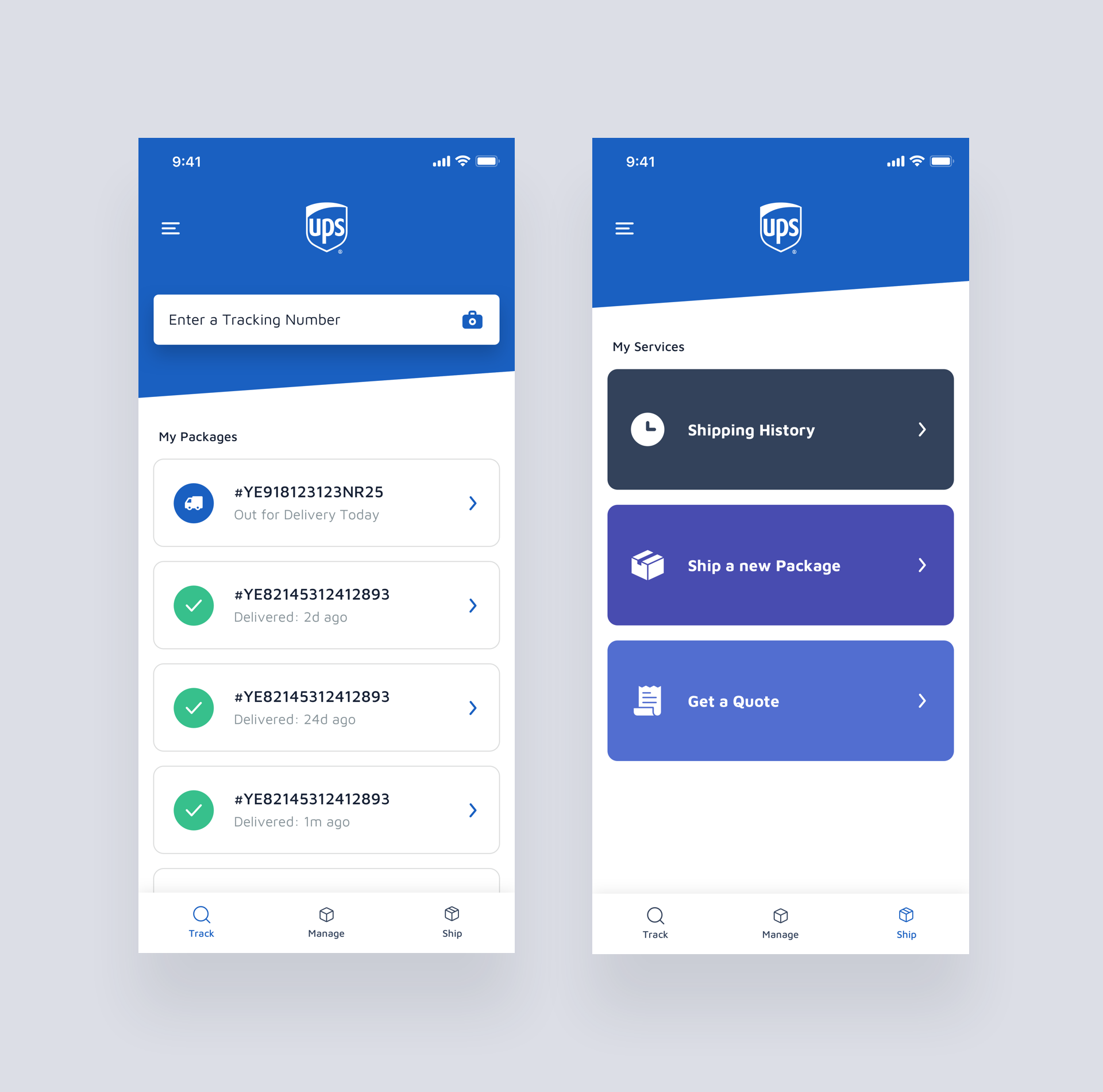
Brief: To redesign the UPS Mobile app.
Hey guys, here’s a redesign concept for UPS Mobile app.
Tried a completely new color palette system away from the current brown/mustard combination that UPS has.
Just a visual overhaul for their current UI. Not much of functional changes. What’s your take on this?
Design Duration: 2 Hours
Typefaces used: Maven Pro
Dribbble: Link
Images: None
Design